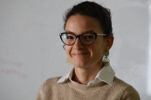
Anna Lombardi tells us how she made the transition from postdoc to interactive journalist

Please give us a brief career history
Despite my purely scientific background, I’ve ended up working as an interactive journalist at the Times and Sunday Times. The path I’ve followed to get here has been anything but linear.
After completing my PhD in Physics at the University of Lyon (France) in 2013, I moved to Cambridge, where I joined the NanoPhotonics Centre in the Physics department as a postdoc.
I had the chance to work in an extremely dynamic and stimulating environment, deepening my knowledge of light-matter interaction at the nanoscale and plasmonic sensing.
Despite enjoying the work in the lab, after three years I decided to rethink my career path to pursue my passion for science communication.
Aware that I needed more technical tools to move into this field, I enrolled in a two-year Master in Science Communication at the International School for Advanced Studies in Trieste (Italy) where I first learned about data journalism and visual storytelling.
While studying, I tried to gather experience in as many fields as possible: from science festivals to science publishing,press office activities and event organization. But I soon realised data journalism was something that intrigued me the most, something always in the back of my mind. This is when I started looking for jobs and, in August 2018, I applied for the one advertised by The Times.
Why were you attracted to this role, how did you find it?
The one t hing that has never changed throughout my career is a deep passion for numbers.
As a researcher I was used to reading through big sets of data and visualising them in the clearest possible way for publication; no surprise that, while studying science communication, I got particularly interested in the field of data journalism and visual storytelling.
When I came across this job opportunity advertised by The Times online, I immediately applied. As soon as I read the job description, I thought that it would be the perfect match between my scientific and communication skills.
What aspects of your postdoc experience were most useful in securing the job?
My scientific background has been considered a plus throughout the recruiting process.
Analytical thinking and problem solving were highly valued, as well as coding and writing proficiency. These are all skills I have developed and improved as a postdoc.
What do you do in your current role – what is an ‘average’ day ?
On a day to day basis, our interactive team helps reporters analysing and visualising data to
go with their articles.
We realise maps, charts and interactive tools to contextualise a story,to provide extra bits of information, to engage with readers and guide them through complex data, to incorporate live or location data, to create reader-focused datasets.
All these tools are added to the online edition of the paper. We often collaborate with journalists to find stories within big datasets by scraping and coding, and we sometimes write data-based stories ourselves.
What do you enjoy?
We cover several stories every day. I love learning about different topics through data, something that journalism and science have in common.
I also enjoy designing (often through coding) interactive charts and bespoke digital tools that aim at challenging and moving an often too static view of the world.
Any aspects that you don’t enjoy?
The fast pace of a newsroom is certainly thrilling but it can also be overwhelming sometimes for an ex-researcher, used to a much slower paced environment.
What are the main skills you use on a day-to-day basis?
Data analysis, few bits of statistics, as well as coding, communication and visualization skills.
What is your one tip for postdocs who might be considering a move to this sector?
Science and journalism have more in common than you might think: good journalism, as good science, relies on precision, method and clarity. There isn’t much difference between a good chart/graph going into a top peer-reviewed journal or printed in a daily newspaper: they both need to be self-explaining, complete and visually compelling.
Addressing the general public instead of your scientific peers is even more challenging for me, as you can never assume “they should already know” part of the story.
If you are passionate about data but also enjoy telling stories and deepening your knowledge of the world, journalism could be your next destination.
